Twitter Rolls out New Design for Threaded Conversations

Twitter has today announced that it is rolling out a new design for threaded conversations on the platform based on testing it performed in the “twttr” app. According to Twitter, the new design makes it easier for users to understand who they are replying to, and the overall flow of the conversation.
The company has been testing the new design in its prototype app called “twttr” for over a year. It also tried out a couple of other design iterations for threaded conversations in the prototype app, including one where replies were displayed inside what looked like chat bubbles. Needless to say, I’m glad that particular design wasn’t the final one.
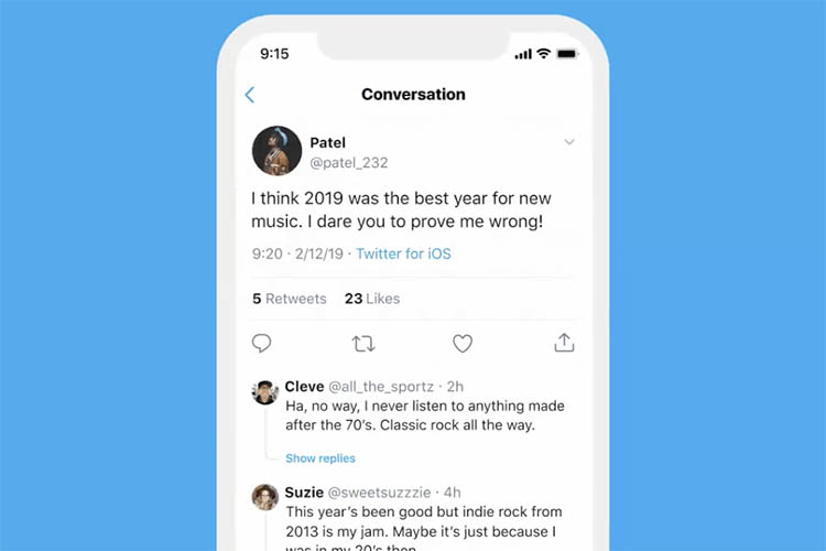
The design that’s currently rolling out on the platform uses branching lines that connect parts of the conversation to each other, thereby giving visual cues to follow a conversation’s natural flow while also staying inconspicuous and out of the way. The new design also hides extra replies under a ‘Show replies’ button to make the whole thing look a lot more clean. Check out the tweet below to see the new design in action.
Your conversations are the 💙 of Twitter, so we’re testing ways to make them easier to read and follow.
Some of you on iOS and web will see a new layout for replies with lines and indentations that make it clearer who is talking to whom and to fit more of the convo in one view. pic.twitter.com/sB2y09fG9t
— Twitter Support (@TwitterSupport) May 5, 2020
Other than the new conversation-oriented design, the platform is also testing hiding engagement buttons — another thing that was originally tested in the prototype app “twttr.”
We’re also experimenting with placing like, Retweet, and reply icons behind a tap for replies. We’re trying this with a small group on iOS and web to see how it affects following and engaging with a convo.
We'll keep you updated as the conversation experience evolves!
— Twitter Support (@TwitterSupport) May 5, 2020
The new design is rolling out to a portion on Twitter users initially on iOS and web, but it should soon make its way to everyone on the platform. I have the feature showing up for me on the web but not on iOS, and so far I have sort of mixed feelings towards it. It looks okay, but also feels out of place at the same time. Have you received the new design? What are your thoughts? Let us know in the comments.

Post a Comment